Building Scalable Design System Components
Teams across Three were solving the same problems independently, creating fragmentation and duplicated effort. I worked with the DDS team, other UX designers and developers to drive alignment, using real journey challenges as the catalyst for change rather than pushing for a top-down mandate. Four reusable components are now live across the homepage, shop and campaign pages, picked up by multiple teams.
The Problem
As Three’s product evolved, teams were quietly solving the same problems in parallel: carousels, shortcuts, promotional patterns, each building their own version. Similar components behaved differently, interaction patterns varied across journeys, and the duplication was slowing everyone down. The issue wasn’t a lack of talent. It was a lack of alignment.
My role
My entry point was always a specific journey challenge. I’d spot an opportunity to solve a broader systemic problem and use that as the catalyst to push for a shared approach rather than yet another one-off. I worked with the DDS team, other UX designers and developers to make sure components were built for reuse and not just for the immediate project. Where multiple teams had similar needs, I facilitated the conversations that got them to a shared solution.
Approach
Rather than pushing for a top-down design system mandate, I worked bottom-up, using real journey problems as the evidence base for change. Each component started with a genuine user need, was tested across multiple contexts, and shared with the wider UX team before being formalised. I worked directly with developers throughout to make sure designs were actually buildable, not just beautiful.
The goal wasn’t to create more components. It was to create fewer, better ones that teams would actually use.
Components Delivered
Carousel
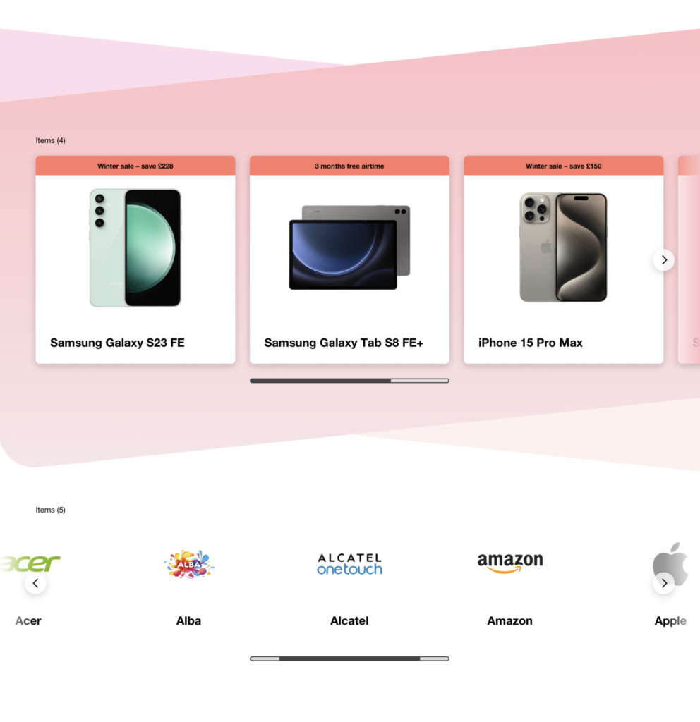
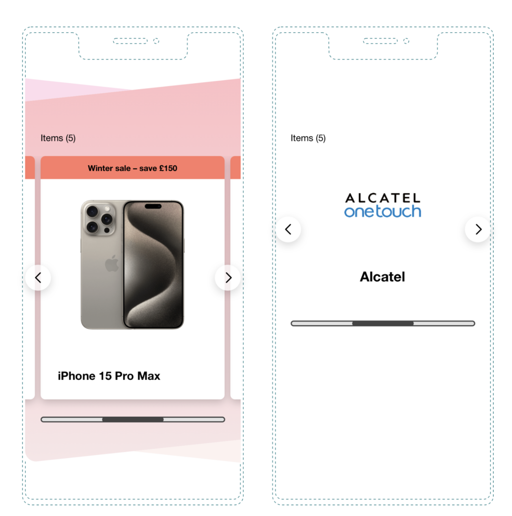
This was my initiative. Working on the Latest Offers page, I could see that long-scrolling pages packed with offers were overwhelming on mobile. Inspired by how Netflix groups content to aid discovery, I proposed a carousel approach that let users scan and swipe rather than scroll endlessly. After a successful launch on Latest Offers, it was picked up across Student Deals, phone bundles and other offer-heavy pages.

Shortcuts
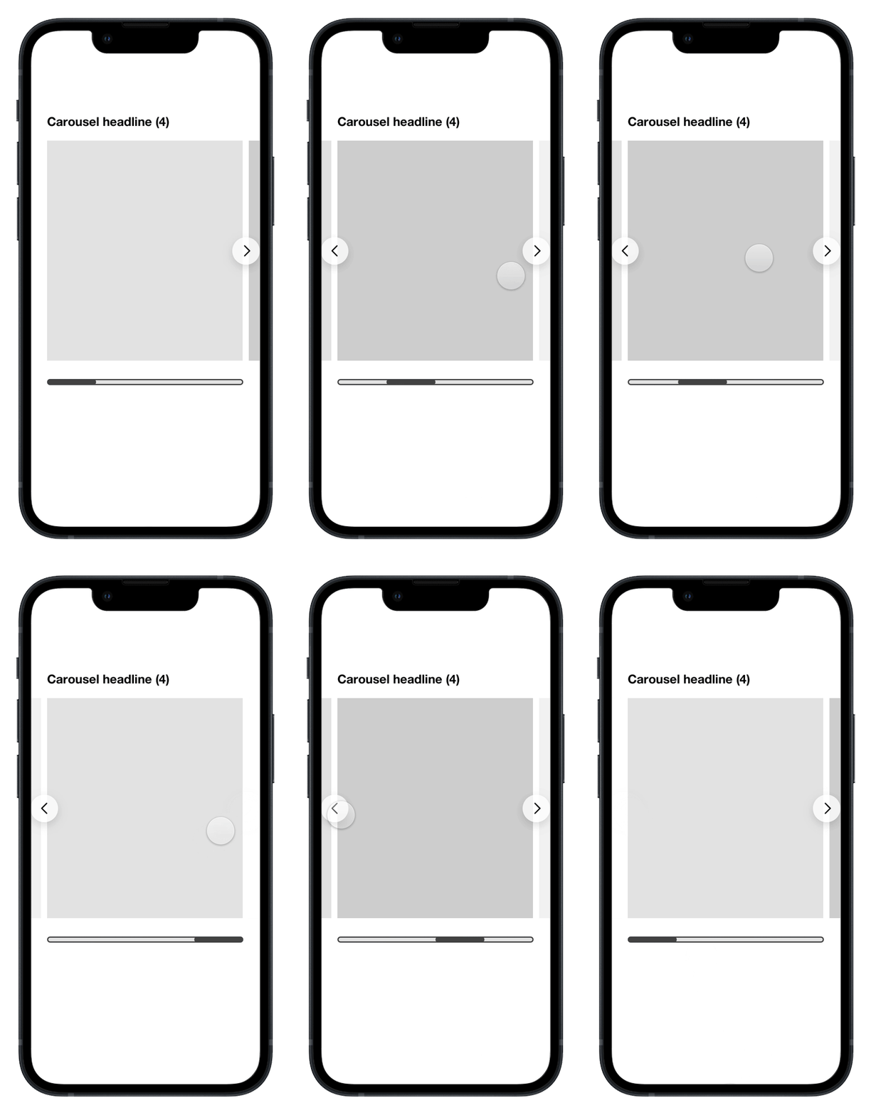
I spotted that another team was heading toward building a new component to solve a problem that an evolved version of Shortcuts could already handle. Rather than let that happen, I brought together the DDS Designer and another Senior UX Designer to define shared parameters that worked across both teams’ needs. One flexible component instead of two fragmented ones.
Countdown timer
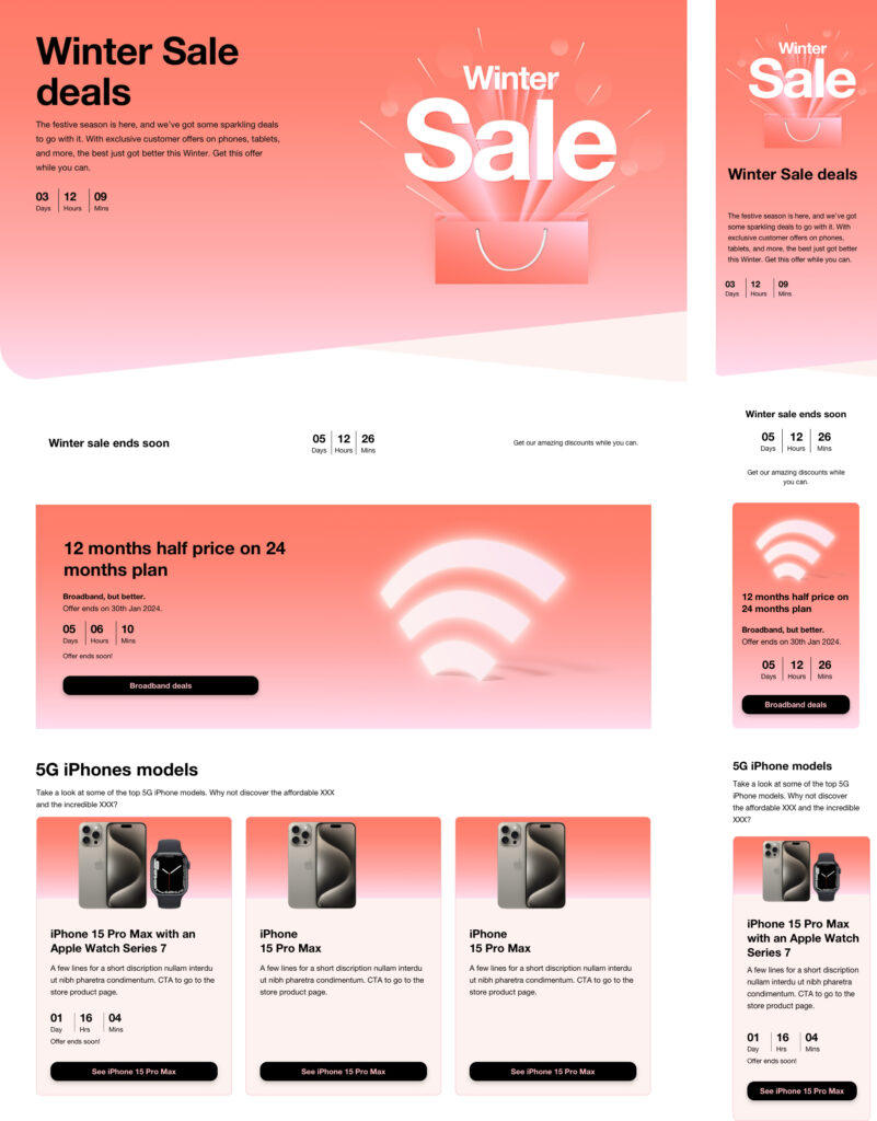
Every time-sensitive campaign launch was getting its own bespoke solution. Working with the DDS team, I helped define a reusable countdown timer with a clear lifecycle covering before, during and after an event, that plugged cleanly into existing promotional components.
Tabs
Tab implementations varied across the product. Working with the DDS team, I helped clarify how the component should behave across different contexts, giving teams a reliable pattern to reach for and reducing the urge to create yet another variation.
Outcome
All four components shipped to production and are live across the homepage, shop, Latest Offers, Student Deals and campaign pages. They were picked up by multiple teams, not because they were mandated, but because they were designed around real use cases. I shared the work at team show-and-tells and other designers built on these patterns rather than around them.
Reflection
The most important skill in design system work isn’t component design. It’s knowing when not to build something new. The moments I’m most proud of are the ones where I stopped duplication before it happened: spotting the overlap, having the conversation, and getting teams to agree on one approach. That’s what actually scales.
| Client: | Three |